
There's a hurdle that makes working with software architecture diagrams harder than it first seems.
Whether it's a formal system, such as UML, or something you make up on the fly, every software architecture diagram relies on standards. That leaves you with a choice to make. Either get started fast and then have to teach everyone else your notation or learn a formal system before you can create your first architecture diagram.
Let's be honest, you're probably not planning to geek out on architecture diagrams. You just want to communicate. And the sooner you can get something written down, the sooner you can make use of the benefits of software architecture diagrams.
So, here are some practical tips to get started with architecture diagrams that'll help you communicate clearly without first needing to learn a whole new language.
Start with a whiteboard
Sure, communication is the end goal of most diagramming. But a crucial part of the process is getting things straight in your own mind.
Those first few drafts are all about the thought process, rather than setting something in stone. So, make your first sketches using a whiteboard. That way, you won't be tempted to put in too much effort and then lose heart when you realise your carefully crafted diagram is totally wrong.
Draw the bigger picture by hand, use a tool to generate the detail
The C4 software architecture diagram model deals in four layers of abstraction:
- the context your code operates in
- the higher level "containers", such as a mobile app or a database (rather than anything to do with Docker)
- the components that make up those apps, databases, file systems, etc
- interactions between the entities within the code itself.
People can sometimes be reticent about using software architecture diagrams due to the risk that they'll diverge from the reality of the code. That's a fair point but one that's easily mitigated.
Focus your hand drawn architecture diagrams on those top three layers of the C4 abstraction model. For one, they should be fairly slow to change. They're also usually the result of a deliberate process that can easily feature a step for updating the diagram.
The architecture at the lower level is often faster moving, with relatively large changes possible in a single pull request by a single engineer. Mandating that developers should update a diagram with every change they make would be a productivity and morale killer.
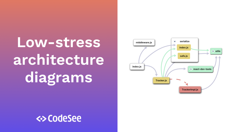
At that lower level, you should rely on an architecture diagram tool to generate the code map. Check out CodeSee's own self-updating architecture diagrams tool and request access to the beta.

With CodeSee Maps, you can automatically generate, color-code and label your codebase's architecture
Use color and shape intentionally
When you come to create a diagram that you'll share with other people, it's time to fix the visual language you'll use.
There are three key rules to bear in mind when choosing your notation:
- Be consistent: if you use a 3:2 rectangle to represent a front end application in one place, always use a 3:2 rectangle to represent front end apps
- Don't rely solely on color: color can be useful but remember that not everyone sees color equally, so don't use it as the only way to communicate something
- Don't get too fancy: there's a trade-off between information density and how easy it is for casual viewers to consume your diagrams; bias your choices towards easy consumption rather than a fancy notation that only a handful of people will understand.
For most situations, some variation on standard flowchart notation makes it easy for you to create your diagrams and for others to read them. However, you shouldn't just hope that people know what you mean.
Provide a key
It might seem like simple advice but a key is essential to making your diagrams easy to read.
For example, you might assume that everyone knows a cylinder often represents a data source. But in some systems a cylinder on its side has a different meaning to an upright cylinder. While it's unlikely you'll want those variations, it's important not to assume that your reader has precisely the same context as you.
That's easily solved, though. Use a key to provide simple explanations of each symbol, arrow type, and so on.

CodeSee Maps automatically generates a key for you to track your labels
Show only what really matters
Let's say you sketch out your first draft. You step back from the whiteboard, pen in hand, and observe your work. With a sinking feeling in your stomach you realise that what you've created is a horrible mess of intersecting lines that even you're struggling to read.
You can avoid that by documenting only what matters. For example, when showing data flows between components there's usually no need to show acknowledgements going back the other way.
And if you do find that you need to show more detail, then it might be time to split that section out into its own separate diagram.
The right way is the one that works
Architecture diagrams have a reputation for being painful to create and even worse to maintain. But they're essential for any team or project where you might onboard new developers, where the system is bigger than what one person can fit in their head, or anywhere code quality matters.
Don't look at diagramming your software architecture as a chore. Instead, think of it as an integral part of your governance process. That way, you'll make choices that are driven by the benefits they deliver rather than by trying to fit into some arcane diagram schema that was last relevant when floppy disks ruled the world. And, if you get a moment, sign up for the CodeSee automated software architecture diagram beta to see how the right tooling can take some of the burden for you.