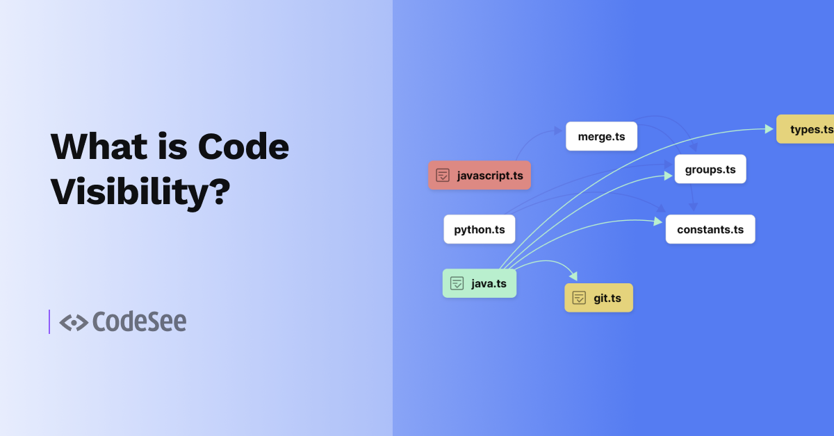
When I joined CodeSee as Head of Design in March, I knew it was to build a suite of insanely useful tools for developers – to explore everything that happens when you run your app, gain insights about how the code works, record your knowledge, and share it with teammates. What I didn’t know, or wasn’t 100% sure about, was the appetite for the team to make the product as easy-to-use and as elegant as possible.
I was pleasantly surprised! Joining the team as the first full-time design hire meant taking in all the pieces and parts of features developed over the past few months and starting the work of unifying the UX and UI. My first week on the job, and with the full support of the team, I rolled up my sleeves and got to work.
An important design principle I wanted to make sure we follow at CodeSee is that the information about a user’s app should come first: the functions, variable names, values, execution loops, and source code. The content should shine and UI elements should recede. Color should be used minimally to help reinforce understanding. The design should communicate information clearly, it shouldn’t distract, and it should educate the viewer about what is being shown and what a user can do.
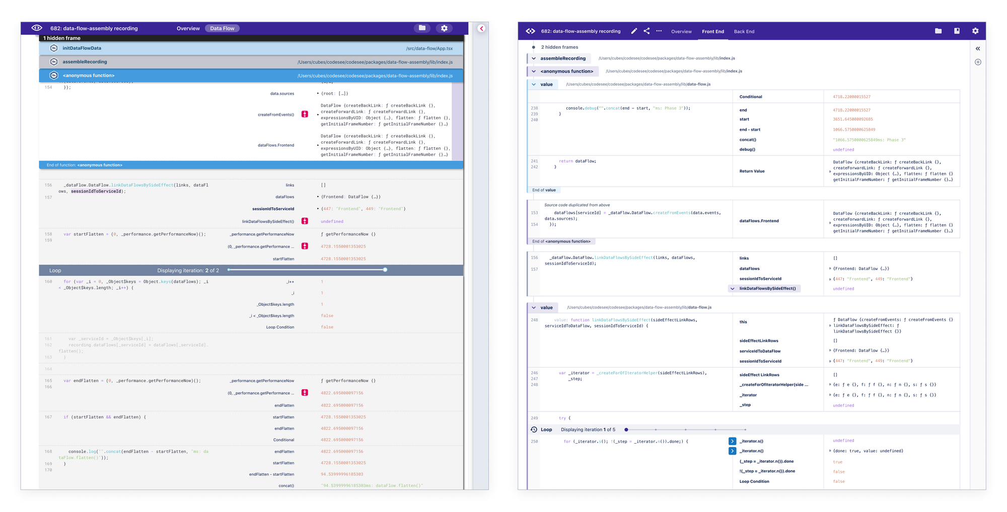
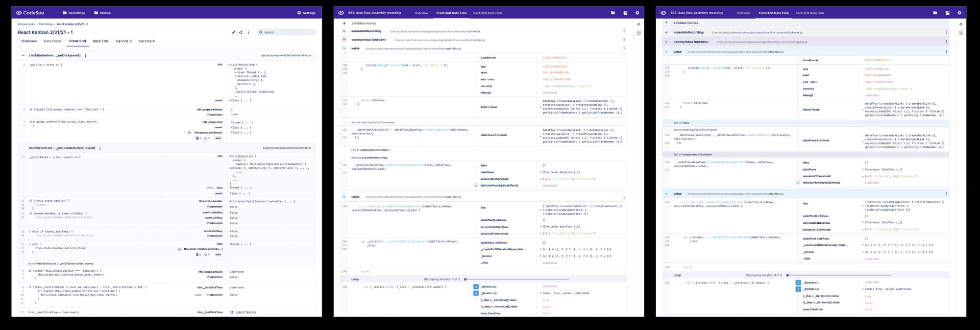
The redesign involved some quick design decisions: a set of color and type scales to standardize the design palette across Figma and Storybook.
The new design also introduces a “timeline” element on the left side of the data flow visualization to make it clearer that information is being displayed in execution order. We’ll be able to use this timeline to show other events that occurred during run time, like user actions and network requests.
This redesign of our data flows provides a less cluttered and more consistent UI that allows you to focus on what’s important – your code and run time data – without overwhelming you, while preserving all of the capabilities of CodeSee our users love:
- Seeing your code in execution order,
- Diving into functions that call other functions instead of needing to build that mental model in your head,
- Writing stories that connect directly to your code as you build your understanding of the codebase, and
- Sharing these stories with teammates make collaboration easy.
Early access users who are in the hosted version of CodeSee will see the new design automatically. If you’re in the local version of CodeSee, you can upgrade to the latest version to experience the updates.
We’re an early-stage company, launching and learning from users rapidly. I’m excited about how we can provide you with deeper insights into your code, without creating or adding to mental overload. Our products will continue to evolve over time, and we welcome your feedback and ideas.
If you are learning about CodeSee for the first time, join our beta to get instant access to our platform and start playing with these features today.
And as a designer in his first couple of months on a new team – I’m really proud of this redesign. It’s a step forward for our users, but just the first step of many. Special thanks to Grayson Hay and our Engineering team in getting these changes out the door and into users’ hands. The best is yet to come!